Saturday, April 15, 2023

Colored Objects by Johann Wolfgang von Goethe

In his “Introduction” to the 1970 edition of Goethe's Theory of Colors, Deane B. Judd humorously stated that “In view of the fact that Goethe's explanation of color makes no physical sense at all, one might wonder why it is considered appropriate to reissue this English translation." The same might be asked of my current printing of “Colored Objects,” a chapter from Goethe's larger Theory. The answer to both conundra is the same. Even if Goethe's scientific conclusions lacked substantive merit, the chromatic phenomena he describes in Theory of Colors are observably true. Goethe was able to accurately describe the way in which color is experienced and the ways in which colors interact with and elicit one another. It was only the scientific explanation as to why these phenomena occur that he could not quite knit together. Goethe's continued relevance as a color theorist, then, is for artistic and poetic, rather than scientific, pursuits. It is not likely that Goethe would have appreciated this assessment. As he wrote to J. P. Eckermann in 1827, “I never observed the natural world for poetic reasons.” Whether this assertion was an example of bombast or a failing of self-knowledge is irrelevant. We can all benefit from Goethe's poetic approach to science. 


When considering how to illustrate Colored Objects, it seemed dubious to use diagrammatic or scientific imagery. Rather than illustrating the disproven science, why not make a book in which the phenomena Goethe describes are able to be experienced by readers as they page through the book? In order for this to work, though, the pace of the reading needed to be slowed down, as each experiment requires time to produce the desired results. This is an important point that Goethe never fully clarifies: for a red disk to elicit a green one, as in the first experiment, the red disk must be viewed in focus for at least twenty seconds before turning the page. Then, after a few seconds, a green disk will appear in its place on the white page. To help slow the reading down, the text is set in my Rapid Stencil typeface, an alphabet of capital letters that conveys a sense of Goethe’s declarative style and marries well with the highly graphic illustrations, while taking slightly longer to read than a traditional upper- and lowercase typeface. In this slowing down of the text the reader is further able to appreciate the beauty of Goethe's scientific “method.”  


Colored Objects is printed on Rives BFK and a variety of other papers, with a number of laser-cut parts (some of which move or can be moved) and two pairs of paper glasses with tinted lenses. The laser cutting was done at Makerspace NYC; the glasses were made by American Paper Optics. Emily Martin provided invaluable insights and technical instruction; and her students at the University of Iowa Center for the Book helped come up with an innovative solution to a challenging illustration. The book was designed and bound by Russell Maret and printed by him and Sarah Moody in an edition of seventy-five copies. 


               A quick gif of the book's content


                  The prototype of the book's slipcase.

Monday, October 4, 2021

A Pattern Book of Cádiz Ornaments

In 2013 I designed a couple of typographic ornaments while thinking of the pavement designs around the city hall in Cádiz, Spain. The ornaments were not intended to be reproductions of any specific pavement designs, they were simply prompted by the memory of a lovely day walking around Cádiz. I included the ornaments in the type specimen at the end of Pressed for Time but never did much else with them.

Cádiz City hall with geometric pavements in foreground.

Then in 2019, as I was working on a book of Sandra Kirshenbaum’s writings, I asked Ed Rayher to engrave and cast the ornaments to use on the book’s end sheets (see From the Editor: The Selected Writings of Sandra Kirshenbaum. San Francisco: Book Club of California, 2020.) Once the metal ornaments were in my hands, I realized that they could be assembled into many more combinations than I had originally imagined. I began to think about a small specimen book. 


Five days after returning from the publication party for From the Editor, the whole country shut down in response to the COVID-19 pandemic. Knowing that the larger collaboration with Carolee Campbell I had been planning would be delayed, a small ornament specimen seemed like the perfect interim project. 


Many of the Cádiz patterns I was designing reminded me of textile designs and, unlike my book Ornamental Digressions, I initially wanted the Cádiz book to starkly emphasize the ornaments’ patterning structure, rather than to concentrate on potential color applications. I thought of early embroidery pattern books, in which the patterns are printed in black ink, as a model for the book that I wanted to make. 


Vecellio, Cesare, Corona delle nobili et virtuose donne. Fatti da Lugretia Romana, Venice: Alessandro de' Vecchi, 1625, Lisa Unger Baskin Collection, Rubenstein Rare Book & Manuscript Library, Duke University.

I soon encountered two problems, both growing out of my innate obsessiveness. As I set the patterns into type, I became convinced that I needed to show every conceivable combination of the ornaments. Distinctions as slight as showing the same pattern rotated 180 degrees seemed critical to the book’s success. Because of this the book ballooned into something that was simultaneously too much and not enough. When I finally changed tack, I was already up to seventy different type formes. Definitely not a small specimen book (more on this later), and certainly not an engaging narrative progression. 


As part of my bookmaking process I always need to break through a certain amount of thickheadedness before I can get to where I want to be. In the case of this book the breakthrough happened while showing the prints to Annie. After looking through my endless permutations, Annie suggested that I might not need to show every combination, that in fact it might be a more engaging book if there was a bit of surprise, a little variety. This may sound obvious now but, once in it, it can be very hard to see over the walls of a design rut. 


At the same time, I was losing faith in the strictly black and white design. Even after discarding extraneous patterns and changing the order of those that remained, I found it boring to page through the book. (For those interested in making books: it is never a good sign if you are bored by your own book.) While casting about for a solution I remembered a large collection of vintage Moriki handmade paper I had acquired when New York Central Art Supply went out of business. What if I printed the patterns in silver ink on alternating sheets of navy and burgundy paper? That would jazz up the book. I couldn’t be accused of making a boring book if it was printed like that!


I pulled some proofs and made my binding model. I was all set to begin printing when I developed a persistent variety of nausea caused by trying to break the unbreakable rule: you can’t go home again. Even though I liked the silver/navy/burgundy design more than the black and white version, the new book felt exactly like something I would have made in the 90s. Just looking at it conjured all kinds of bad memories from my twenties, never mind the aforementioned nausea. And besides, once I stripped away the colored paper and silver ink, wasn’t it still the same repetitive, stagnating narrative as the first book? Each page eventually felt like every other page. I craved movement but designed stasis instead.


Finally, the stagnation broke when I realized that I was concentrating on how the pages looked rather than what I wanted the book to be. And what I wanted was a book that felt like a salesman’s swatch book, something assembled from different shapes and sizes, that showed potential without being restrictive, that was not too neatly put together, that had a bit of randomness to it. I began looking through my flat files and found all kinds of vintage papers, none of which I had enough to print an entire edition. They would be perfect for this book. My first go at the new design was a five-signature book that was going to require nearly 100 press runs. But it was what I wanted, labor be damned!


In mid-March 2020, I set to work printing the first press runs, realizing at the end of each day that I felt very tired. Unusually tired. One week later Annie and I were both diagnosed with COVID-19. That experience, and the ensuing treachery carried out by the Republican party—both in their handling of the pandemic and their attempt to illegally steal the presidential election—changed my creative priorities for the next year. 


The positive result of this period was having my student Sarah Moody come live with us for three months while we printed the Three Constitutions. When we finished that book, I suggested to Sarah that she move to New York and continue to work for me part time until the Ninja Press Bibliography was ready to print (the previously mentioned collaboration with Carolee Campbell), at which time she would switch to full time work. For those part time months, the specimen book was the perfect project. I set Sarah the task of changing my five-signature dummy into a single signature of a mere 41 press runs. (After printing the book, I realized that some of the sheets had an unacceptable level of show-through. Rather than discard these sheets, I added an “Appendix,” a second signature in which the sheets could be seen, but at a remove from the rest of the book. To make this happen required a final, 42nd pressrun. Not exactly a small specimen book….) Some rough pictures can be seen below.


In addition to the Cádiz ornaments, the book is set in my Baker and hungry Dutch typefaces, making it the second book I’ve printed entirely from metal typefaces that I have designed. (The first being The Book of Jonah from 2012.)


A Pattern Book of Cádiz Ornaments will be available in a week or so on my website, russellmaret.com.


Thursday, January 21, 2021

2021 New Year Card

Every year I try to print a new year's mailing that captures the spirit of the time, or at least gives a sense of how I'm feeling about the year just past or the one that lies ahead. I generally aim, with varying success, to get the card out by mid-February. For the last two years I have been unable to make even this deadline. I just haven't known how to greet the year. Since 2016 I have oscillated between mild and feverish on the sad and discouraged scale, and I did not want to print another sad, discouraged card. For 2017 I printed the last stanza of W H Auden's "September 1, 1939," and for 2018 I printed a large, pleading "HOPE?" So this year it was with relief and excitement that I could print a card that captured my sense of relief for the coming year, and to do so in a way that might not make anyone sad.

Monday, January 4, 2021

Three Constitutions

Over the last four years the content of my printing has steadily changed. The political and social upheavals that have riven this country into splinters have slowly seeped into my work. It has not been an entirely welcome change—I have never been a fan of overtly political artists' books—so I have been exploring ways in which I can make politically-inspired work that is both consistent with my aesthetics, and meaningful without being preachy or self righteous. It is a difficult balance to strike. 
 
While choosing the texts for my book Character Traits (2017–2019) I noticed that my choices were colored by the absurdity of our President and his enablers. I was not trying to make a political statement with the book, but the politics edged itself in all the same. The hyper-politicization that was infecting every aspect of my daily life could not be kept out of my work. Surprisingly, my timidity about bringing politics into my books was absent in my ephemeral work, and I began printing small mailings that allowed me to directly express my frustration, anger, and helplessness. 
 
My "LOSER" postcard sent to Donald 'Jailbait' Trump at the White House after Joe Biden's victory.

Character Traits provoked another significant realization about how my lettering and type design relate to the content of my books. Historically, my lettering has been divided into two distinct categories: large, interpretative letterforms on one hand, and proper, constrained typefaces on the other. For over twenty years I have tried unsuccessfully to find ways for these two alphabetical impulses to merge into some hybrid form. What Character Traits taught me was that it was not the lettering that was preventing me from doing this, rather it was the content of my books. The template I had been using in my work was to isolate my interpretative or abstract letterforms on single pages, and then write notes about them in my more traditional typefaces. In order to merge my two lettering impulses, I had to move on from this approach and change the content of my work.

With all of these ideas swirling in the background I began work on a new book project called Three Constitutions. The book was inspired by the increasingly contentious conflict between "originalists," those who view the Constitution as a prescriptive cultural artifact delineating American "civilization," and those who view the Constitution as a flexible instrument conceived to adapt to the evolving political and social realities of American "nationhood." This is a conflict we are all familiar with, but what got me started working on Three Constitutions was that in the blaring echo chamber of the hourly news cycle, the originalists were, and are, dominating the discussion. 

The problem with these zealous, self-described Constitutional "patriots" is not dissimilar from that of religious zealots: if (and it's a big IF) they have bothered to read their primary document—the Constitution or whatever their holy book happens to be—they have done so through self-justifying blinders. How many Constitutional "originalists," for instance concentrate on the fact that the fourth phrase of the preamble is to "insure domestic Tranquility" or that the sixth is to "promote the general Welfare?" How many self-proclaimed "Proud Boys" understand that the second amendment is an amendment, and therefore provides its own justification for being revisited and amended further? The more likely scenario is that these originalists have not read the original documents at all. Instead they encounter the Constitution at a remove by relying upon the interpretation of others for their beliefs.  

The idea that developed from these musings was to print the Constitution in three ways. One large volume would contain the actual text, but it would be printed in a typeface that is difficult, though not impossible, to read. This volume would be accompanied by two smaller volumes, each of which presented an interpretation of the original text. In thinking about the primary contemporary means of doctrinal interpretation, it struck me that there are two: 1) party apparatchiks (President, senators, media commentators, communities, churches, etc) and 2) the internet/social media. One's party interprets by lopsided emphasis and redaction, resulting in an edited version that fits their political aims. The internet interprets by algorithm—providing you with either a best guess version of what someone like you (or who the algorithm assumes you are) would want to hear, or a version that is determined by the limitations, or motives, of the person who conceived the algorithm. 

For the redacted version, I had the full text of the Constitution and Amendments set in my Hungry Dutch type. I then went through the text and highlighted key words or phrases to be redacted by physically turning the type upside down. These inverted pieces of type print as black rectangles, resulting in pages that look similar to how redacted government documents look.

For the internet version, I fed the original text through a series of translations using Google Translate. It was first translated into Esperanto, as an expression of the Utopian ideals behind the text and the language. From Esperanto, the text was then translated into Russian, from Russian to Chinese, and Chinese back to English. The resulting text is something like the original, but different in subtle yet meaningful ways. For this volume I designed a typeface that feels very much like a digital design, using simple geometric forms. 

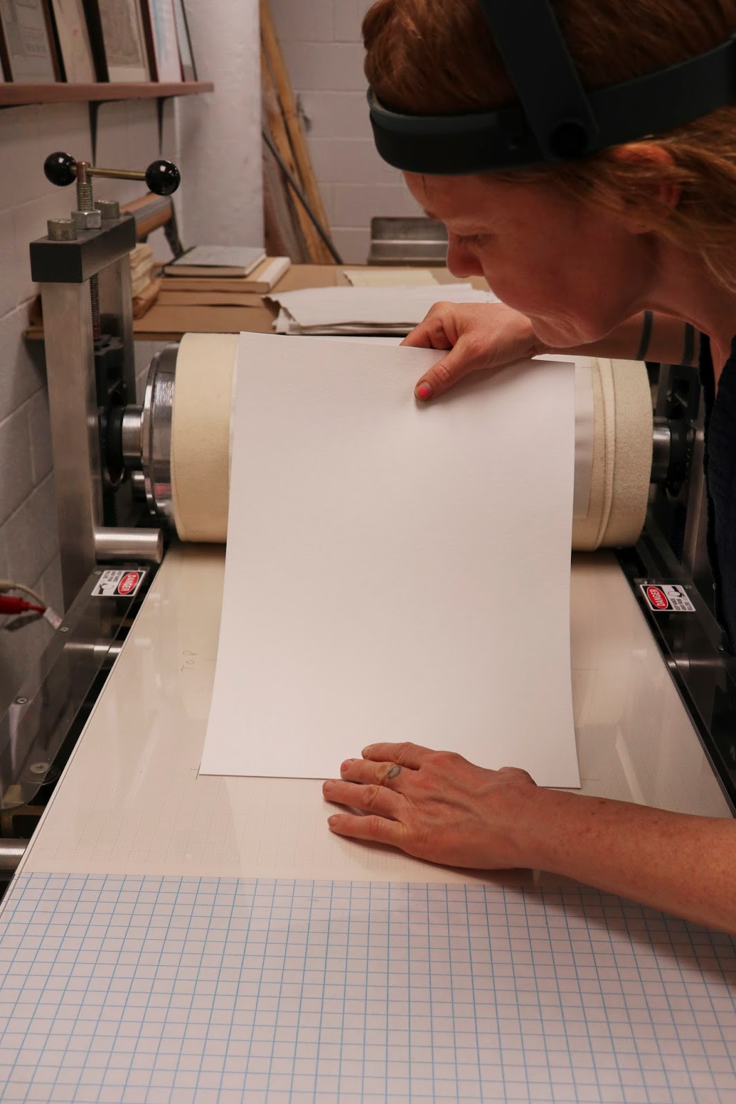
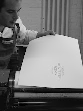
In the beginning of November my former student Sarah Moody moved in with us to work on the project. Since then we have finished the internet volume and are currently printing the redacted version. Later in the month we'll begin work on the larger volume. Below are a selection of photos of the process so far, mainly taken by Sarah.

 
Freshly cast Hungry Dutch type from Ed Rayher at Swamp Press.

 
Determining page breaks and corrections in the Swamp Press galleys.


 Breaking the type into pages.

 
Galley proofs marked up for redaction.

 
Redacting the type by turning it upside down.

Proofing the redacted type.

 
Correcting the redacted galleys.


The redacted galleys and spread.
 
 
Proofing a spread from the Google translate version.
 
 
Checking position.
 
 
Making ready a spread.
 
 
Checking ink density.

 
Striking a page as printed in the dummy.

 
Paging through a gathered finished copy.

Monday, December 24, 2018

Two Color Intaglio Printing in Character Traits

For the two color plates in Character Traits, I use the same basic process as the one color plates—I apply the ink by squeegee, wipe with tarlatan and newsprint (and hand if needed), and clean the edges—before laying down a top of color ink with brayer. I originally intended for most prints in the book to be two color, but this intention was modified early on when I realized the complexity of the process. It had never occurred to me in the planning stage that I would need to completely clean the plates between each print to prevent the two inks mixing in successive inking and wipings. This adds an enormous amount of time to the process as the plate not only needs to be cleaned but also dried between prints. Additionally, certain plates in which the intaglio image is too fine simply do not work in two colors. The solution was for both the standard and the deluxe copies to contain a few of the same two color prints, while a selection of prints appear in one color in the standard copies and two colors in the deluxe. Below are some images of each step of the process photographed by Annie Schlechter.


Tuesday, April 17, 2018

Photopolymer Intaglio Printing Process used in Character Traits

The intaglio printing process I am using in Character Traits is fairly standard, with just a few peculiarities based on my use of photopolymer plates. For most of the plates, particularly those with thicker line work, I need to modify the ink I'm using by adding a substantial quantity of magnesium carbonate. Without the magnesium, the ink is too easily wiped out of the lines prior to printing, and, during printing, has trouble holding a crisp edge. Polymer plates also present some difficulty during the inking and wiping process due to their light weight—they don't want to sit still, and an already messy process quickly becomes unmanageable. To compensate, I am taking advantage of the plates' steel backing by sticking them on Bunting magnetic bases while inking and wiping. This keeps the plate in place and gives me a larger surface on which to work. To protect the surface of the magnetic bases I place a sheet of stiff cover stock between plate and base. The paper barrier also makes lifting the plate from the magnet much easier than it would be otherwise. 

For most plates, the steps are as follows: 
Place the plate down on the paper-covered magnetic base  


Draw ink across the plate with a plastic squeegee, rocking the edge back and forth to force the ink into the larger areas; scrape the surface of the plate with the squeegee to remove excess ink
Wipe with tarlatan twice (with each tarlatan session I use progressively cleaner pieces of material to prevent ink transferring back to the plate from the tarlatan)
Wipe with the edge of my hand vertically, horizontally, and at 45 degrees. Then wipe a third time with tarlatan
Lift the plate off the magnetic base and use a galley magnet to hold the plate while wiping the edges with mineral spirits


Place a cleaner sheet of paper on the base before replacing the plate (throughout the edition I regular change these sheets of paper to prevent ink transferring back from the paper to the plate during wiping)
Wipe with tarlatan and then polish with newsprint, repeating this process once or twice depending on the plate

Clean the edges one last time
Place the plate on the bed of the press
Then Nancy places the dampened sheet of paper, cranks the press and lifts the print, after which we begin the process again