Friday, January 30, 2009

Æthelwold Etc Color Diary: Week One


Æthelwold Etc will be published in both a standard and a deluxe edition. The book itself will be the same in both editions – I don't want anyone to feel that they are getting a second quality book. Instead, the deluxe will have two extras: 1) a suite of prints of all 26 letters and 2) a color diary of draw downs of all inks mixed for the book (estimated at between 100 and 150 individual colors). After three days of printing, I have mixed nine colors.

Æthelwold Etc: Week One


September 30
Editioned the first four colors of what is now a nine color A. I put the rollers through three intermediary conditioning steps to achieve the specific translucency and hue I was going for in the green. In comparison to what I printed today the proof I pulled on Monday looks muddy and indelicate. The inspiration for the coloring is the faint green in the Feliciano manuscript. It's not my intention to mimic watercolor in print – Æthelwold is very specifically a printed book – but it is important to me that some of the background light that is peculiar to watercolor be evident. For the outline, I ended up printing it in a purpley gray which, when printed alongside the green, reads convincingly as a pencil line.


September 29
Finished editioning the O. I have spent most of the last 12 years wanting to print this image. It is based on one of the startlingly centripetal pavements in the Duomo of Florence.

Monday, January 26, 2009

First Proofs from Æthelwold Etc.


I have never printed nine colors on one page. The proofing process of Æthelwold is not simply to check plates or drawings or even specific colors. It is part of a process to learn how nine colors that I have in my head actually work together – if they do – in print.

Upcoming Events

CODEX International Book Fair
February 9-11
Pauley Ballroom, UC Berkeley Campus
Come spend a few sunny days in Berkeley. I will be showing the first pages of Æthelwold Etc. as well as a selection of my books in print. Visit http://www.codexfoundation.org for more information.

Letter Forms as Content
Society of Scribes Annual Meeting 2009
February 26, 6:00 pm

at the Type Directors Club, 347 West 36th Street, Suite 603
I will be giving an illustrated talk about my work, particularly the development of proprietary lettering and type faces for my books.
$20/$15 for students. RSVP to director@tdc.org.

Bodoni, Byron, and Bordeaux
March 28 & 29
The Center for Book Arts, 28 West 27th Street, 3rd floor
Join me for a weekend of connoisseurship. We will sample beautiful letter forms, romantic poetry, and delicious wine. Visit the Center for Book Arts for more details.

Wednesday, January 21, 2009

Inscription on the Real Alcazar in Sevilla


Click on the image above for a better view. The layout and lettering of this inscription is reminiscent of Mosan Romanesque champlevé enamel work. Compare with the great altarpiece of Nicolas of Verdun in Klosterneuburg, Austria

Monday, January 19, 2009

Works in Progress

I am currently working on three separate book projects with the expectation of completing at least two in 2009.

Æthelwold Etc.
Twenty six letters inspired by other letters, non-letters, and little bits of poetry
With accompanying notes by Russell Maret
This will be my first printed alphabetical treatise. The work will comprise twenty six letter forms, printed on recto only, each inspired by a diverse array of historical styles, literary references, and daydreams. Each composition will be printed in rich, multi-chromatic letterpress. To give an idea of the work's complexity, the A is 8 colors and will require 9 plates. The O is one of the more subtle drawings at only 5 colors.
The sources, inspirations, and thought process behind each letter will be explained in depth in an accompanying section of notes.

Pervigilium Veneris
by Tiberianus
translated by Bruce Whiteman
I received Bruce's translation last week and it is fantastic. I will begin working on the layout in February.
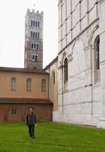
Swan & Hoop 2: Lettered in Lucca
by Russell Maret
The second issue of Swan & Hoop is a guide to the public lettering in the beautiful Tuscan city of Lucca. I have begun researching the essay, but Æthelwold is driving me to distraction. I hope to begin printing this autumn.